To abide by a non-disclosure agreement, company, client, and product identities have been obscured in this case study.
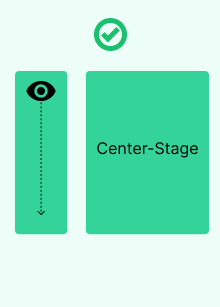
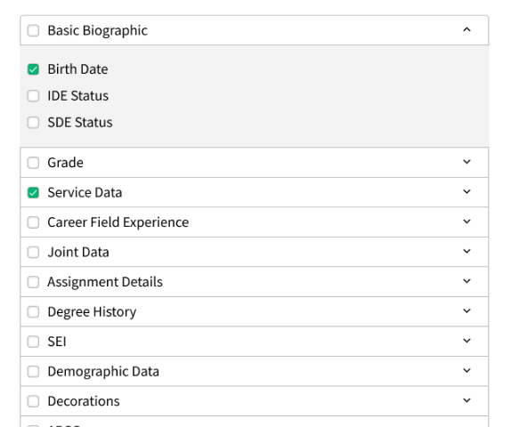
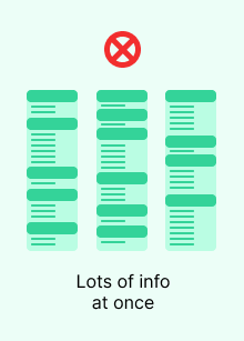
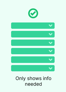
Slide to view the before (left) and after (right).
Wireframing first lets me iterate fast on feedback and take a step back to focus first on layout, use cases, and other foundational concepts.
View the WireframeMultiple equal columns confuse, but a "two-thirds, one-third" layout gives the user a focus. The Interaction Design Foundation calls it choosing what's "center stage."
A PDF embed, an accordion list, and some text. The UI is minimalist and not doing anything complicated or unconventional. I live by Steve Krug's “Don’t Make Me Think” mentality.
When users wanted to see their progress they'd, generate and download a PDF. Today, it updates live as they change it.
Now, the user can take the process one step at a time.
I didn't have the resources to dig into UX research, but this project proves that UX/UI and visual design best practices can go a long way on an experience that needs some love. Stakeholders immediately wanted to turn this layout into a template for all their custom document buildning needs.
Check out more of my work