400+ Pages. Zero Clarity. One Research Study That Changed Everything
To abide by a non-disclosure agreement, company, client, and product identities have been obscured in this case study.
Overview
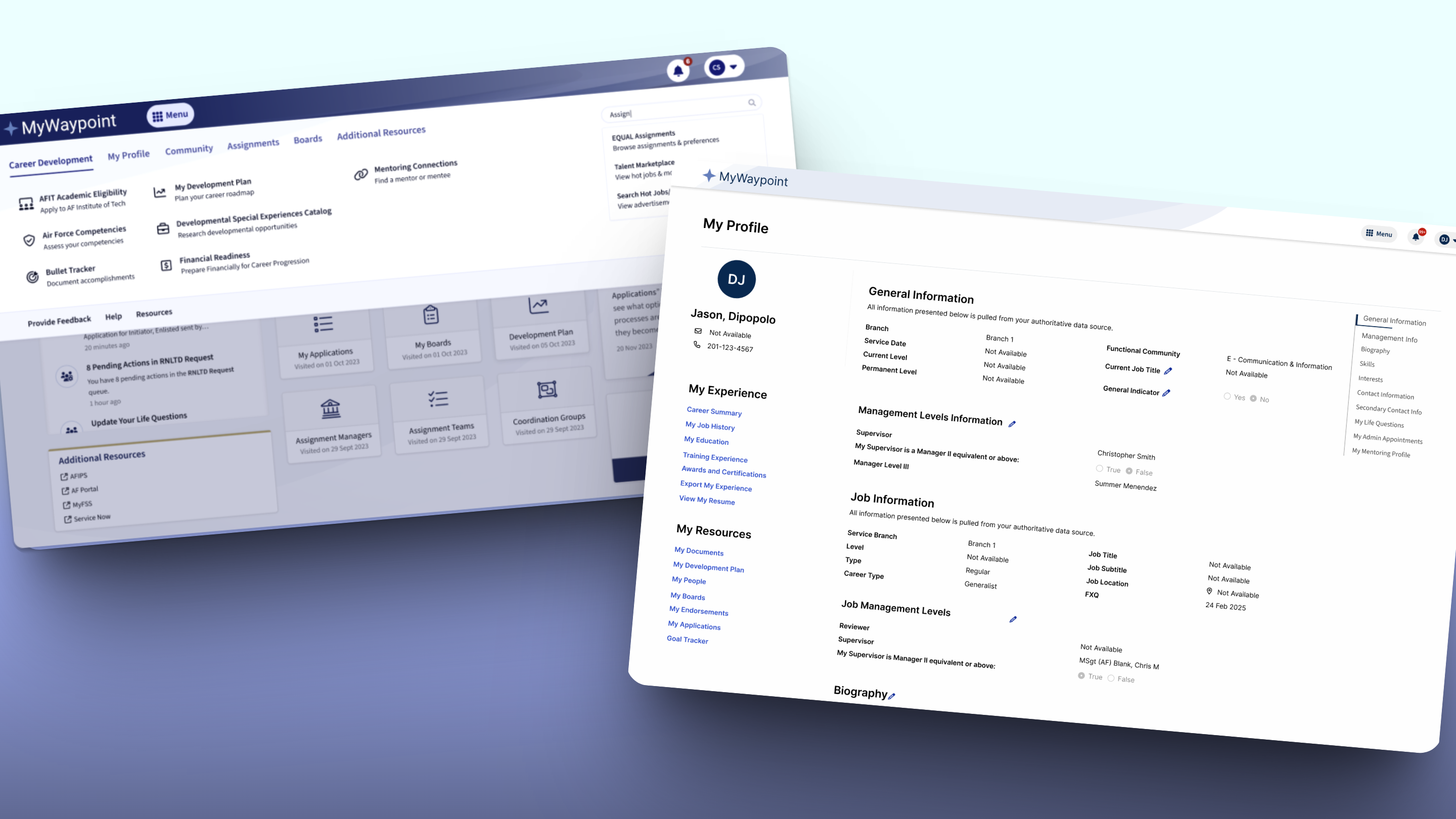
User research swings our navigation's grouping, labels, IA, and overall user comprehension in a powerful, new direction.
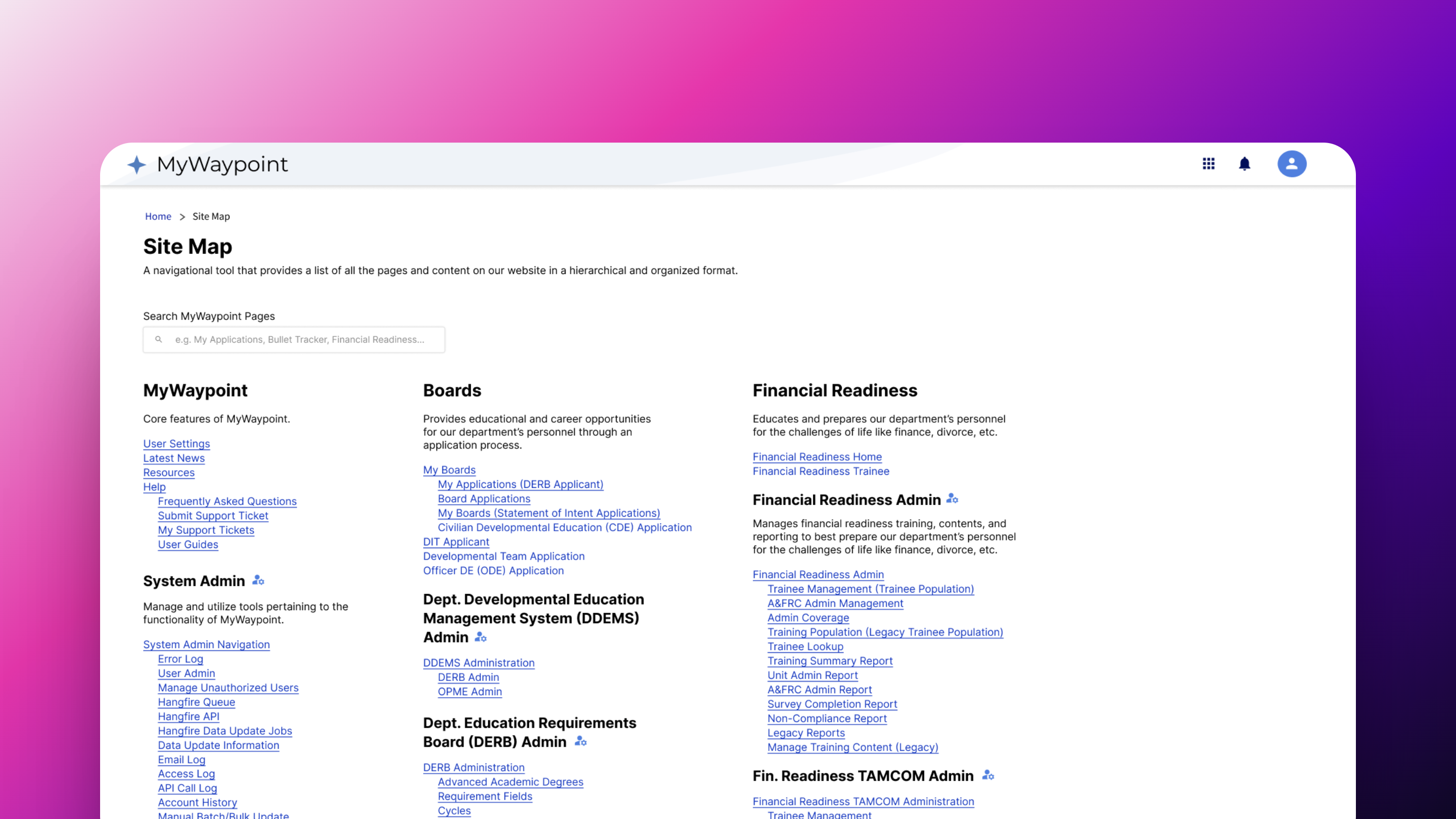
- Created 400+ Page Sitemap
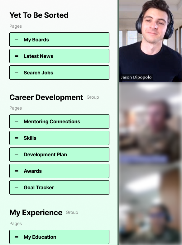
- Prepped 88-card Card Sort
- Facilitated Card Sorts for 20 Users
- Facilitated 20 User Interviews
- Presented research findings/solutions
- Made user highlight reel
- Front-end development
- Resolved issues in dev
My Role
Collaborated with a UI designer and developer as the UX designer on a 1-month web project for the Dept of Defense, serving military personnel on desktop and mobile.
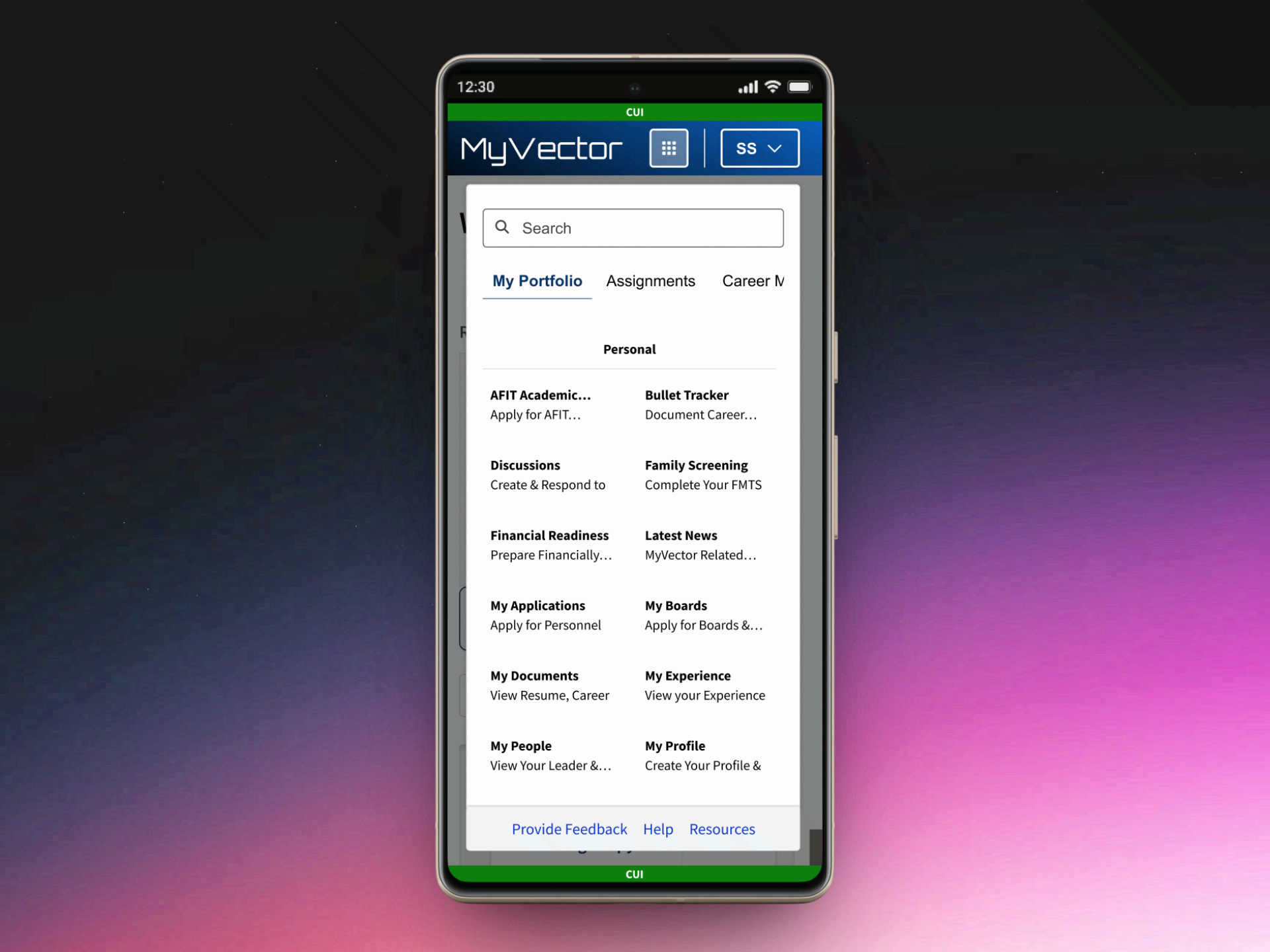
The Challenge
Multiple, messy navigation menus on a 400+ page enterprise platform created mass confusion in findability for our users.